Content
1. Start
2. Introduction
3. Problems To Solve
4. Target User
5. Design Critique I
6. Design Critique II
7. Proposed Solution
8. Conclusion
9. Appendix
Design Analysis of
MRT Door Screens
A Final Design Project by Marcel
Introduction
In 2022, an average of approximately 2.7 million passengers a day used the Mass Rapid Transit (MRT) in Singapore. Safe to say there are alot of people riding the MRT everyday and they range from young children to the elderly.
We will look at one of the designs in the MRT: The screen above the doors inside the MRT. Specifically, we will look at the design from the East-West Line.
For this project, 5 people were interviewed on their User journey and their general thoughts on the design. We will look at their User Persona and the data collected will be used throughout this project.
Intended Problems To Solve
An overview of the screen designs during the user journey
Background: The original analog design needed to be replaced as Singapore as a growing nation, has constant construction and upgrades of new stations. Thus everytime there is a new station, the old physical display needs to be replaced. Hence they needed to create a digital display containing all the same information and more information which only a digital display can provide.
The main problems to solve are providing relevant information to travellers at different stages during the journey easily and accessable at any point in time or wherever they are in the train. So that users will have ease of mind ease of mind of where they are and they won't miss their stop.
Let's take a look at the user journey (ft. me):
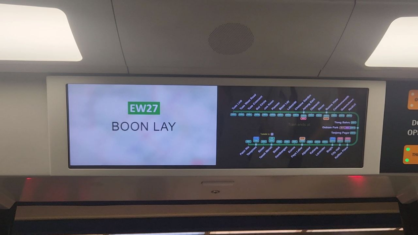
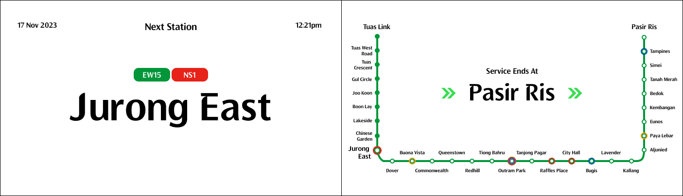
1. User gets on train, train starts to depart
The screen will play from departure and in between stations
Problems intended to solve: Inform the user where they are heading towards, the station they just left and more upcoming stations. At the same time try to sell products to users since they are already looking at the screen.
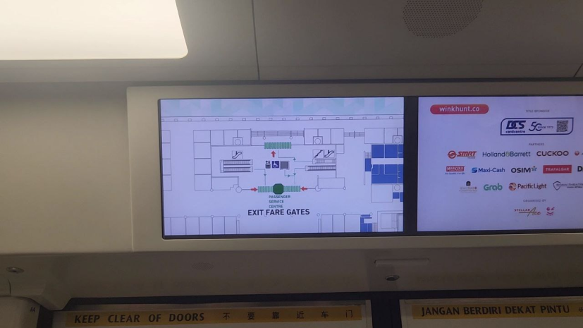
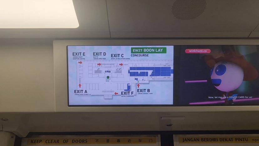
2. Train arriving into station
This screen starts to play as the train slows down until before the doors open
Problems intended to solve: Give users information on the station to make their commute easier and help them to save time. The goal was also to help users who are new to the station quickly famaliarise themselves with the station and its exits.
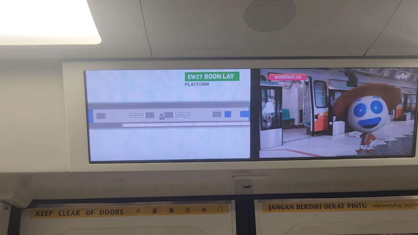
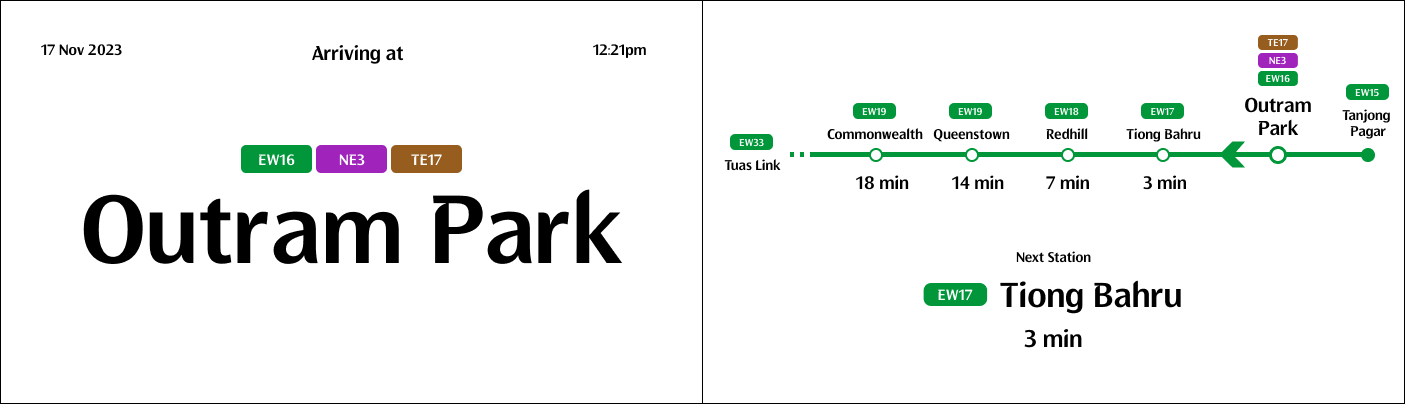
3. Train doors open
This screen flashes on and off until the just before the doors close
Problems intended to solve: Inform users on the train what station they are at and if they are not getting off, then allow them to see how many more stops they have remaining.
4. Train doors closing
This screen appears as the doors are closing until the train starts to depart
Problems intended to solve: Warn users that the doors are closing and providing a countdown so people dont rush out of the train and get injured or killed.
5. Train departs, cycle repeats
This screen appears right after the doors close and will last till the train is about to arrive at the next station
Problems intended to solve: Users would look up as the train is moving to see the next station and this screen tries to provide that information to them and upcoming stations. It also flashes the map to help users see how many more stops they have left to their destination.
These screens and their designs will the focus of this project and will be victim of critique in the later sections. We will now explore the problems that SMRT tried to solve with these screens' designs
Target User
Who are we aiming to help? What are their needs?
For this project, we will focus on 1 target user. Specifically, university students aged from 21 to 24 years old (based on user interviews). A user persona will be created and then we can explore Jobs To Be Done and How Might We to better understand their pain points and needs.
Meet Our Interviewees
Nadia
21 y/o
University Student
Home, School,
Yoga
University Student
Home, School,
Yoga
Darryl
24 y/o
University Student
Home, School,
Shopping
University Student
Home, School,
Shopping

Ryan
22 y/o
University Student
Home, School,
Wildlife Photog
University Student
Home, School,
Wildlife Photog
Ziqi
22 y/o
University Student
Home, School,
Meet Friends
University Student
Home, School,
Meet Friends

Joel
24 y/o
University Student
Home, School,
Social
University Student
Home, School,
Social
'More stations, I wanna to see the |
User Persona
A user persona is template based on the behaviours and mindsets from research. It is important as it helps to build empathy for the end user and develops clarity for the design. Based on the interviewees, we can create a user persona that looks something like:
21 - 24 year old university students, who are going to class early in the morning in a packed train and going home late at night in an empty train. They take the train on most weekdays. On exam days they also need to know if they will be on time. Weekends they go meet their friends or go out with family
Goals
Get to school or the place where they hanging out with their friends.Be on time / know if they are running late
Pain Points
Rather use phone for checking the full map as map on train is not easily accessableWants to know where they are
Behaviour
Checks the screen once or twice per journey, especially when the train is arriving at the station or departing the stationUses their phone most of the time
Jobs To Be Done & How Might We
Situation When I / He / She...
Describe as much as possible the context where the job to be done has to be executed.
Taking the MRT, travelling from one place to another, most likely from school to home from home to school (main use)Motivation I want to...
What are the most central tasks that must be accomplished in getting the job done?
Information on where the user is and how many more stops remaining / how much time leftReadily available information at any point during the journey
Goal/Expected Outcome So I can...
Understand why your customer do this
So they can be on time for class / knows if they is going to be late/ ease of mind, knows when to get off, doesnt miss their stop. Convenience, less frustration, dont have to move around just to find that information
User needs
Knowing where they are
Knowing what is the next station
How long more to their destination
Wont miss stop
Know long more to destination for ease of mind
Knowing what is the next station
How long more to their destination
Wont miss stop
Know long more to destination for ease of mind
Now that we have the condensed user needs, we can critique the design. We will see if the design fulfils the user's needs first then take another purely based on Elements & Principles of Design & Usability Heuristics & Gestalt Principles of Design
Design Critique I
Based On User Needs
Based on the user interviews conducted, this section will present each stage of the user journey along with the design and the user needs based on the stage. Then we will look at the design to see if it has fulfilled the user needs or not. These user needs are based on the interviews conducted.
Departing / Between Stations
User Needs
Next station The departing station
Number of stations to destination / A map of the line or a full map of the system
Direction of train
Duration of ride from one station to another
Fulfilled
- Next station is shown
- Departing station is shown
- Able to see how many more stations to destination
Not Fulfilled
- How many stops more to user destination
- More stations in the left screen
- Too small to see anything from far
- Not reliable because the other half is when it's showing ads
- Duration to next station
- Direction of train not clear
- Too short duration to count stations, flashes quickly before ads come
- Previous 1 or 2 stations before in case missed stop
- Map doesn't show where you are now
Arriving At Station
User Needs
Station name that the train is arriving at The next few stations so the user can prepare to get off
Exits information (which exit goes to which mall)
Fulfilled
- Exit information is shown and user can save time
Not Fulfilled
- Does not show how many more stops to destination
- Major bus interchange in that station
- Screen / Information flashes so quickly that you cant see what's going on
Doors Open At Station
User Needs
Current station, so that they don't miss their stop Duration / Number of stops to their destination
Timer for how long more before the doors close starting when doors open
Fulfilled
- Current station is shown clearly
- Users are able to count the number of stops to their destination
Not Fulfilled
- Timer for how long more the doors will stay open
Doors Closing At Station
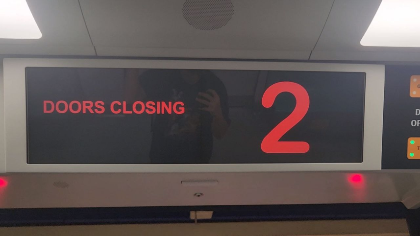
User Needs
Time to next station Door closing to warn people
Dont need this screen because can tell that the doors are closing, it will be too late to exit the train at this point
Fulfilled
- Shows doors are closing
Not Fulfilled
- Countdown not useful at all for people inside the train
Overall, the screens do somewhat fulfil the user needs, however there is definitely room for improvement to cater to our user persona's needs more.
Design Critique II
Based On Design Principals and others
In this section, we will take a look at the graphic in the screens and critique them based on these rules: Elements & Principles of Design, Usability Heuristics and Gestalt Principles of Design.
Usability Heuristics: For this particular critique, I have decided to only use these rules, since this screen is non-interactable:
- Visibility of system status
- Match between system and the real world
- Consistency and standards
- Aesthetic and minimalist design
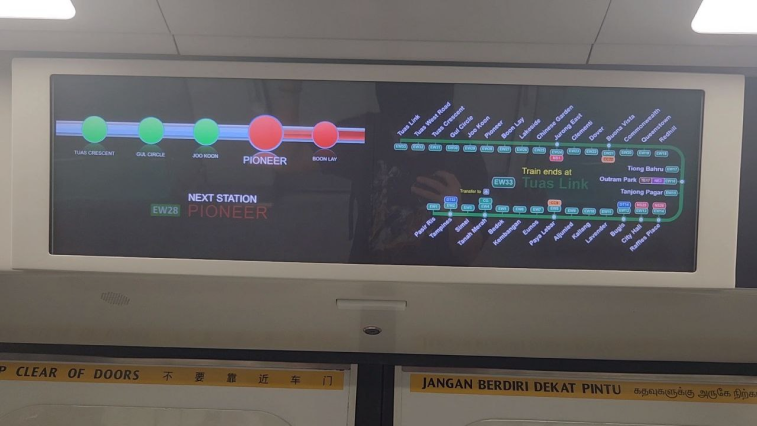
Departing / Between Stations Left Screen
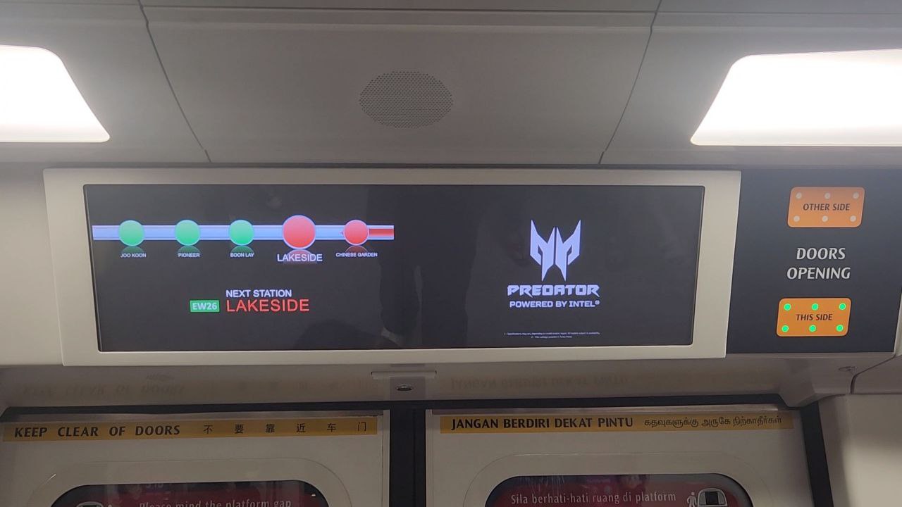
Follows Gestalt's Law Of Continuation And Uses Movement
The red bar animates and moves towards the left and this helps to guides the user's eyes towards that direction, helping to them easily see the next station and the stations after that
Misuse of Contrast
The background is black and the station name uses a bright red, which is difficult to see. The text 'Next Station' is in white which draws the users' eyes there first instead of the station name, which is the more important information. The station number 'EW26' is wrapped in a bright green box too.
These bright elements agasint the black background confuses the eye on where to look and the information the display tries to convey is not clear. Colourblind people also might not be able to see the station name if the contrast is too low.
These bright elements agasint the black background confuses the eye on where to look and the information the display tries to convey is not clear. Colourblind people also might not be able to see the station name if the contrast is too low.
Unclear Typopgraphy
The font size for the station name can be much bigger, both for accessbility purposes and also to make it easier for people to get that information easier. A bigger font size would also help to make the station name more prominent, drawing attention to it to emphasise it.
Typography is also inconsistent with the LTA identity font used in the rest of the MRT system, making it inconsistent.
Typography is also inconsistent with the LTA identity font used in the rest of the MRT system, making it inconsistent.
Not Aesthetic
'Interfaces should not contain information that is irrelevant or rarely needed'. That is one of the Usability Heuristics. The reflective graphic of the station names and circle draws necessary attention and makes the information harder to see. It does not add any asthetic value either.
The fading in and fading out animation of all the elements on the screen is also not necessary and makes it more difficult for users to get the information they want. If users look up at the wrong, they have to wait for the lengthy animation to complete before they can see what station is next or where they are.
The fading in and fading out animation of all the elements on the screen is also not necessary and makes it more difficult for users to get the information they want. If users look up at the wrong, they have to wait for the lengthy animation to complete before they can see what station is next or where they are.
Others
The theme overall is very outdated.
Departing / Between Stations Right Screen
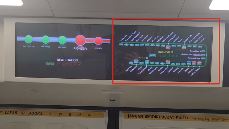
Follows Gestalt's Law of Continuation
The use of lines to create a flow and helps to guide the user's eye towards the next or previous station. It is also a good attempt at fitting the map in the small screen while keeping readability as high as possible.
Mismatch Between Design And Real Life
In real life, pasir ris is on the right side of singapore while tuas link is on the left. The green line represented on the standard MRT map reflects this and users have gotten used to seeing the green line in this way.
However, this design does not follow Jakob's Law, increasing the cognitive effort needed to understand the map, making the information unclear. To make things worse, this map only flashes briefly as the train leaves the station, switching to ads after 5-10 seconds. This is not enough time for users to understand the map.
However, this design does not follow Jakob's Law, increasing the cognitive effort needed to understand the map, making the information unclear. To make things worse, this map only flashes briefly as the train leaves the station, switching to ads after 5-10 seconds. This is not enough time for users to understand the map.
Cramped Elements, Lack Of Negative Space
It is understandale that the screen is small and to fit a whole map inside that space is challenging. However, the text showing the direction of the train is squeezed in together with the map, making it difficult to see and it feels very suffocating.
Miuse Of Similarity
'Train ends at' and 'Transfer to' are both in bright yellow. Firstly, these elements are stealing attention from other more important elements like the stations' names. Secondly, both elements in yellow gives the idea they are related in same way, but they are not, which adds additional subtle confusion to the user.
Arriving
Bad Use Of Emphasis
The use of the green colour to indicate the station name is not bad however they also use the blue colour to highlight some part of the staton which I am also not sure what it is supposed to represent. This distracts from the elements that actually need emphasis like the station name and exits.
Too Many Elements
There are too many shapes and lines used in these designs and there is no clear visual hierocracy for the elements. There is not enough time for the user to see all the information and to understand it, adding on the confusing visual hierarchy, all the user will see is a complicated graphic. It is difficult for users to convert 2D drawings to 3D space too.
Other Comments
I think I understand that they were trying to fit as much information as possible into the screen to make sure of the digital display. However it can definitely be designed better with a clearer layout and visual hierarchy.
Doors Open Screen
Good use of negative space
The use of negative space helps to give emphasis on the elements that are important which is the station name and line.
Bad Typography
The background is has a texture and the text has too little font weight and the font size is abit too small. This combination results in reduced readability of the station name, especially for people with poorer eyesight or are further away.
It would be better to use a thicker font weight and increase the font size. The background is actually the MRT map with a blurred texture laid on top. This is completely unnecessary as it is not noticable enough and only serves to clutter the design.
It would be better to use a thicker font weight and increase the font size. The background is actually the MRT map with a blurred texture laid on top. This is completely unnecessary as it is not noticable enough and only serves to clutter the design.
Emphasis On The Wrong Element
The station number wrapped in the green box has a high contrast agasint the semi white background. This creates a visual hierachy where the user looks at the station number first before the name, creating emphasis on the wrong element. The font size and weight of the station number is also too high, which draws attention to it.
Poor Visibility Of System Status
'The design should always keep users informed about what is going on, through appropriate feedback within a reasonable amount of time'. This screen also has a fade in and fade out animation which lasts several seconds. In terms of user hecristics, this is a bad user interface as it does not show the station name consistently or reliably.
Warning: This next section has an extremely biased critique due to my personal hate for the comic sans font used and the overall bad design.
Doors Closing Screen 1
Inconsistent Typography
In the previous screens that we have seen, the type used was something similar to an Arial font, whereas this is comic sans or something similar to that. Even though both are sans serif fonts, comic sans has more prominent curves and this creates inconsistency in the design.
Uneven Alignement
The 'Doors Closing' is not even aligned to the center of the screen.
Other Comments
The comic sans ruins the whole design theme because it looks so childish and out of place. I conceed that despite how ugly the screen is, it does fulfil its purpose, it does fulfil users' needs to tell them the door is closing. I think this screen is a very lazy design and done up with little to no thought and this creates a bad asethetic.
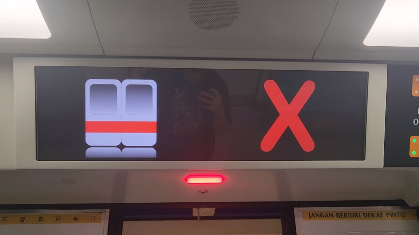
Doors Closing Screen 2
Lack of balance
The left side of the screen shows a door that uses gradient and has a 3D feel to it, whereas the right screen has flat colours. This throws the whole graphic off balance and makes it seems abit weird due to the inconsistent design styles.
The left side is trying to emulate a real life experience of a door closing even showing the graphic of a real MRT door while the right side is just showing a 2D flat ugly cross icon. It is not cohesive.
The left side is trying to emulate a real life experience of a door closing even showing the graphic of a real MRT door while the right side is just showing a 2D flat ugly cross icon. It is not cohesive.
Unnecessary Elements
There is no need for the reflection of the door. I am glad the design is consistent with the other screens. Consistently ugly and outdated.
Proposed Solution
Time To Make It Beautiful
Keeping in mind our user persona's needs:
Knowing where they are
Knowing what is the next station
How long more to their destination
Knowing where they are
Knowing what is the next station
How long more to their destination
Based on their needs and the design critique, we can propose a new design for each stage of the user journey. Assuming that the physical double screen cannot be changed, we will only be changing the design of what is shown on the screen. I also decided to use the LTA identity font to keep the design consistent with the rest of the LTA. Full list of references can be found in the appendix.
Departing / Between Stations Screen
Next Station Design (Left)
The left screen design is quite simple and minimalist. The next station is what most users wanted so I made the font size very big so it can be seen anywhere on the train. The use of negative space also helps to focus the main information on the screen. Even though the time and date are not user needs, I felt that they helped to balance out the whole design and also provide useful information.
Map Design (Right)
The map on the right was designed to emulate real life and the current MRT map for the green line, which goes from left to right and has a slight dip before going back up. I wanted to reduce as much cognitive load on the user as possible and design something that people were already familiar with so they can find their stop faster (Jakob's Law).
There was an attempt to emulate the analog screens with the glowing dots to show the train's position to show where the user was.
There was an attempt to emulate the analog screens with the glowing dots to show the train's position to show where the user was.
Reference: Isolated Green Line Map
Train Direction
Since I had alot of white space left over from the design, I decided to put the direction of the train big and clear along with the arrows with showed the physical direction in which the train was moving. This allows users to quickly pick up the direction they are going towards.
Disadvantages
One of the disadvantages with this design is that the map on the right has station names which might be abit small and cannot be seen from far away. This is the result of trying to fit the map into this small screen while maintaining the design that I was trying for.
Another thing I noticed was that if the direction was removed, there would be confusion for the lighted and non lighted dots. Are the lighted dots upcoming stations or previous stations? This is another flaw that could be fixed with more research.
Another thing I noticed was that if the direction was removed, there would be confusion for the lighted and non lighted dots. Are the lighted dots upcoming stations or previous stations? This is another flaw that could be fixed with more research.
Doors Open Screen
Current Station Design (Left)
The left screen embodies the same design principles as the previous screen. Based on the user interviews, users would usually look up to see what station they are at when the train is slowly down / arriving at the station. Thus, the use of negative space helps to focus the user's attention to the center element which is the station name in a big font.
The boxes containing the colour of the MRT line and the station number has significant padding to show the colour of the station more so users can quickly identify if they are at the station or interchange they want to go.
The "Arriving at" text is small as it is not the focus of the design and just adds extra balance and complete information for the user. The date and time on either side of the screen balances out the design and provides useful information since the user is already looking at the screen, they dont have to look at their phones to check the time.
In combination, these elements allows users to obtain the station name quickly and since there are no fading animations or ads, the users can reliably get the information they need.
MRT Line Design (Right)
This screen was designed with user needs in mind: They wanted to know the time to their next station and how many more stops to their destination. This design shows the next station in a bigger size at the bottom and it shows the time to the next station. The number of minutes will count down in the actual implementation.
The right screen also features a line showing 4 stops ahead and the previous stop. The time to the 4 stations are also shown, this helps to inform the user the time left to their destination as per the user needs identified. The previous stop was included so users can check if they missed their stop.
The arrow in the middle of the line points to the direction of the train and at the end of the line there is the terminal station name. Since knowing the direction of the train is not an important need of our user persona, these elements are not so prominent and are smaller in size.
Since this screen will be shown when the train is at the station, the station it is currently at is in a bigger font than the others so users can identify their position on the line.
Reference: Taipei's MRT door screen
Disadvantages
The MRT Line Design (Right) may appear squeezed when implemented in the actual screen. There may be too many elements in the design itself and that could cause confusion to the elderly or even the user especially if they see the screen for the first time. The learning curve for this design is not as low as it can be. There could also be better placements of elements and the overall design to give it a more clean look.
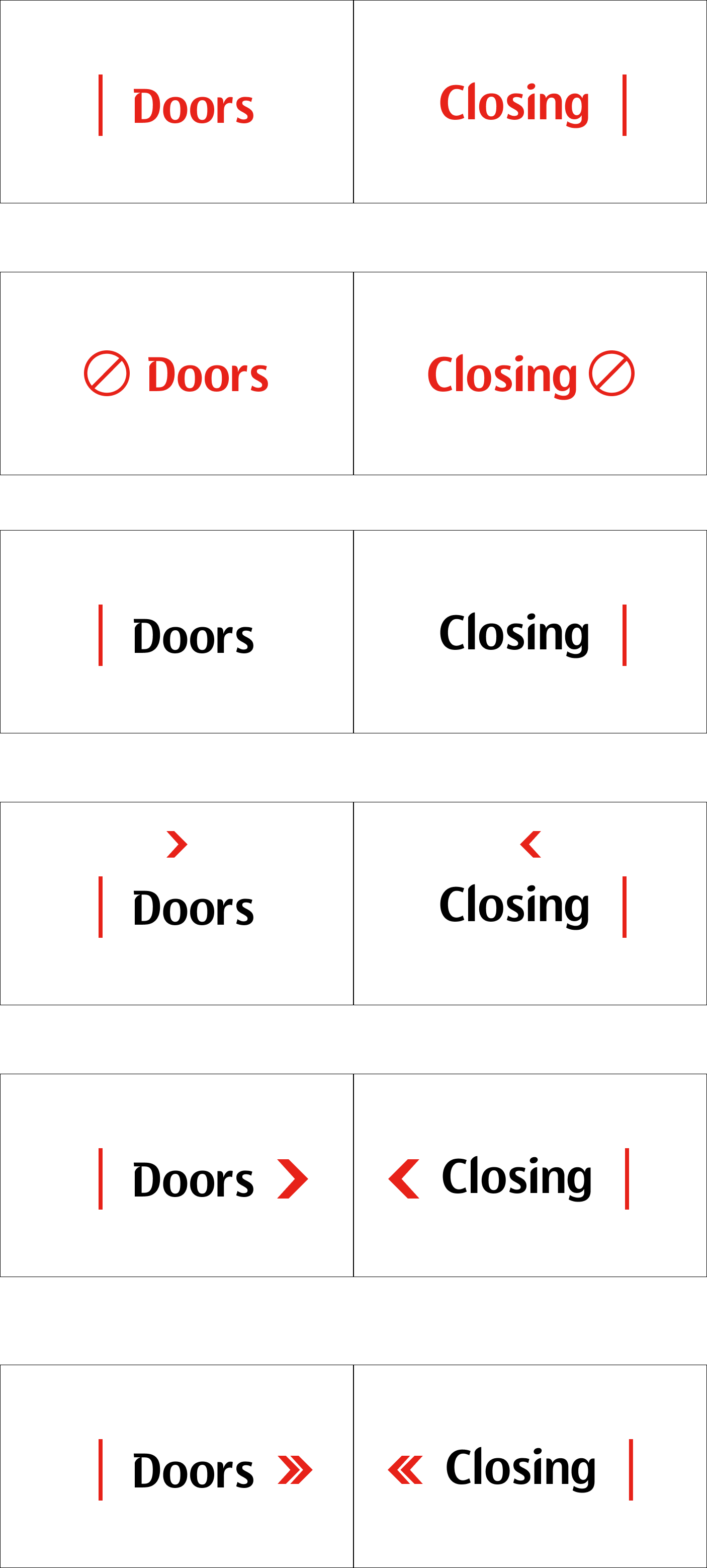
Doors Closing Screen
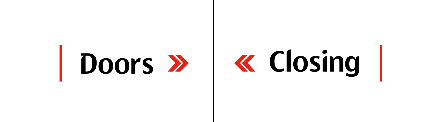
Simple Design
Based on user interviews, users do not require any information other than the information that the door is closing. A simple design with an animation of the doors closing is able to serve this purpose. This prevents people from dashing out of the door at the last moment. Therefore the design of the screen is using big fonts and big elements so people can see the information presented from anywhere in the train.
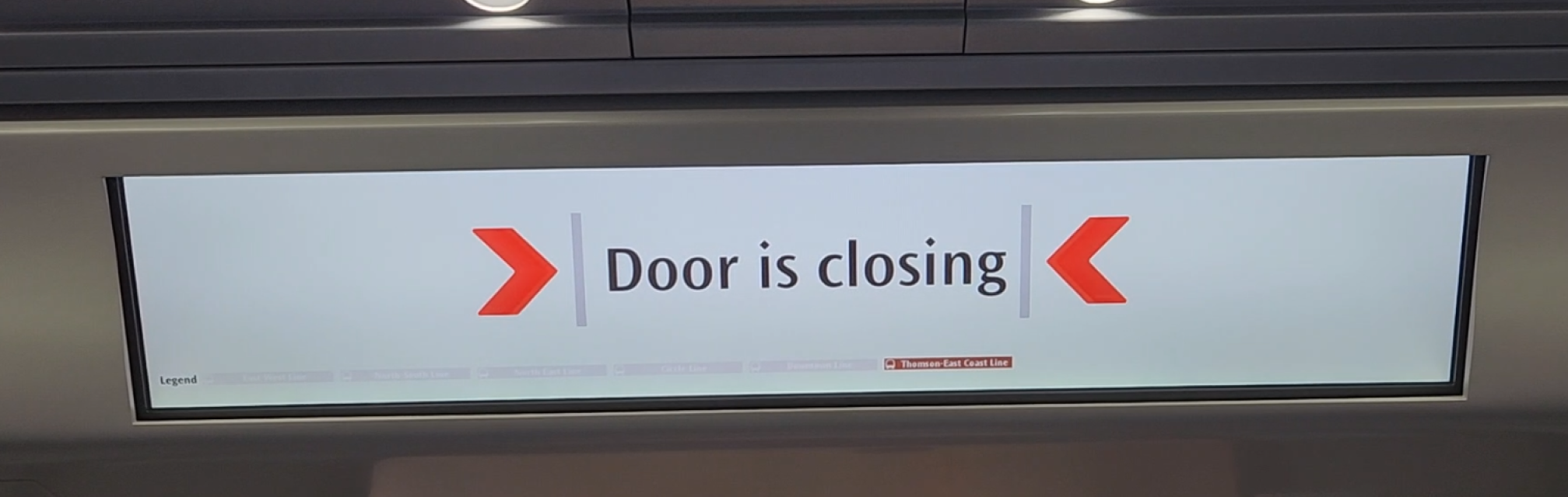
Reference: Thomson East Coast Line Door Screen
Other Ideas
Animation to emulate a door closing and transitioning to the screen for next station
These are just some ideas I had based on the design principals learnt throughout the sememster and tailoring them to the user needs. There is no redesign for the exit information screen as users do not generally need that screen thus this redesign did not include it.
References and more ideas can be found in the appendix, in the figma design file.
References and more ideas can be found in the appendix, in the figma design file.
Conclusion
Overall Thoughts & Reflections
Other Personas
The proposed solutions shown are designed purely on the user persona of a uni student and does not take into account other groups of people who have different needs. This is something to look into as the eldery have bad eyesight and it is important to include the station name all 4 languages. Designs that take these into account are needed and will be researched on more after this sememster is over.
Hardest part of the project
For me personally, designing a brand new interface or design is quite difficult because it is difficult for me to think out of the box or be creative as I think I am very rule-following. However, after understanding the user needs from the interviews, it was abit easier to design based on their needs. The lessons on good interface design and the revision on design principals also helped alot in this process. Overall this course has helped me to better understand the design process and gain a better appreciation for design (now I notice Norman doors everywhere).
Things to do
I think that I could have done more detailed and thoughtful designs and after this sem is over, I definitely will try to polish up this website and my ideas.
Appendix
Explore the Figma!
marcelyap.dev
19 Nov 2023
19 Nov 2023